
via Aesthetica
In college, one of my graphic design professors had the strangest expressions for talking about and critiquing graphic design pieces. One of these expression was to call a particularly well-designed element a “little moment.” At first I thought this was ridiculous. After all, a moment is a measure of time, not the measure of the quality of a graphic element. Eventually though, I came to enjoy this expression; along with my professor’s many others. The phrase, in fact, is the perfect analogy; it compares a well thought-out graphic element to that moment in time when everything suddenly makes sense. The “aha moment,” if you will. …FYI, “aha moment” was another favorite phrase of my graphic design professors :).
In case you’re wondering, I’m telling this story because I’m thinking about starting a new post series called “A Nice Little Moment.” In it, I will share images that I think contain nice little moments. This is the first edition!
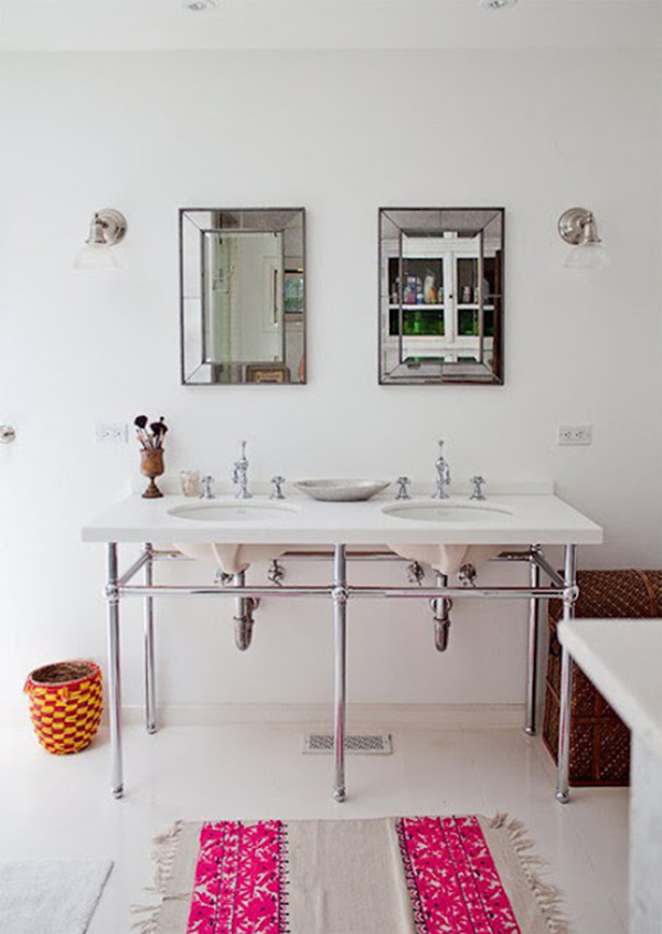
So, what do I think is nice about this photo? …the symmetry! Usually, I’m not one for symmetry because I find pieces that are asymmetrical to be more dynamic and compositionally pleasing. That is unless the symmetry of a piece is perfectly exact. …and the decor of the bathroom in this photo is pretty darn close! 2 ceiling lights, 2 wall sconces, 2 mirrors, 2 sinks all centered in the composition. The real kicker (or nice little moment) is how the 2 bright pink stripes on the rug align with the 2 sinks and the 2 mirrors. This made me happy!
